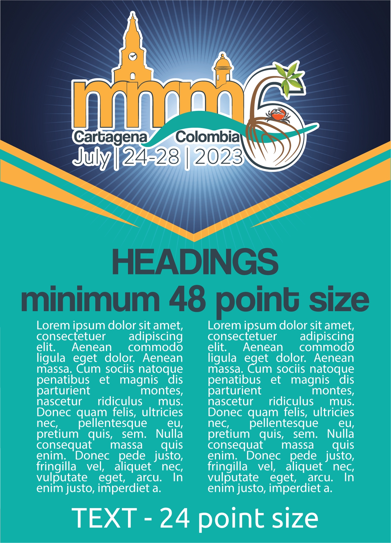
13 Jun General guidelines for poster production
A poster should be self‐contained and self‐explanatory, allowing different viewers to proceed on their own while the author is free to supplement or discuss particular points raised in inquiry. Presentation should be kept simple and clear and a mixture of text and graphics is recommended. Remember that the viewer, not the author, as in the case of slide presentations, determines the time spent at each poster.
Poster Maximum Size and Layout
Dimensions (90 cm wide X 120 cm high)
Materials should be mounted or printed on colored poster paper or board. Use matt finish rather than glossy paper. Arrange materials in columns rather than rows. It is easier for viewers to scan a poster by moving along it rather than by zigzagging back and forth in front of it. An introduction should be placed at the upper left and a conclusion at the lower right.
INFORMATION FOR POSTER PRESENTERS
Illustrations
Figures should be designed to be viewed from a distance and should use clear, visible graphics and large type. Each figure or table should have a heading of one or two lines. Additional essential information should be provided below in a legend. Photographs should have good contrast, sharp focus and, if necessary, an indication of scale.
Text
Minimize narrative. Use large type in short, separated paragraphs. Numbered or bulleted lists are effective ways to convey a serious of points. Do not set entire paragraphs in uppercase or boldface type.
Titles and Fonts
Titles and captions should be short and easy to read, in Arial font for preference. Use large lettering as this means a number of people can read the poster from a distance without overcrowding. Remember to caption your poster with the abstract title, authors’ names and affiliations

J. Ernesto Mancera
MMM6 Chair
On behalf of the MMM6 Organizing Committee


